Branding
BCG U
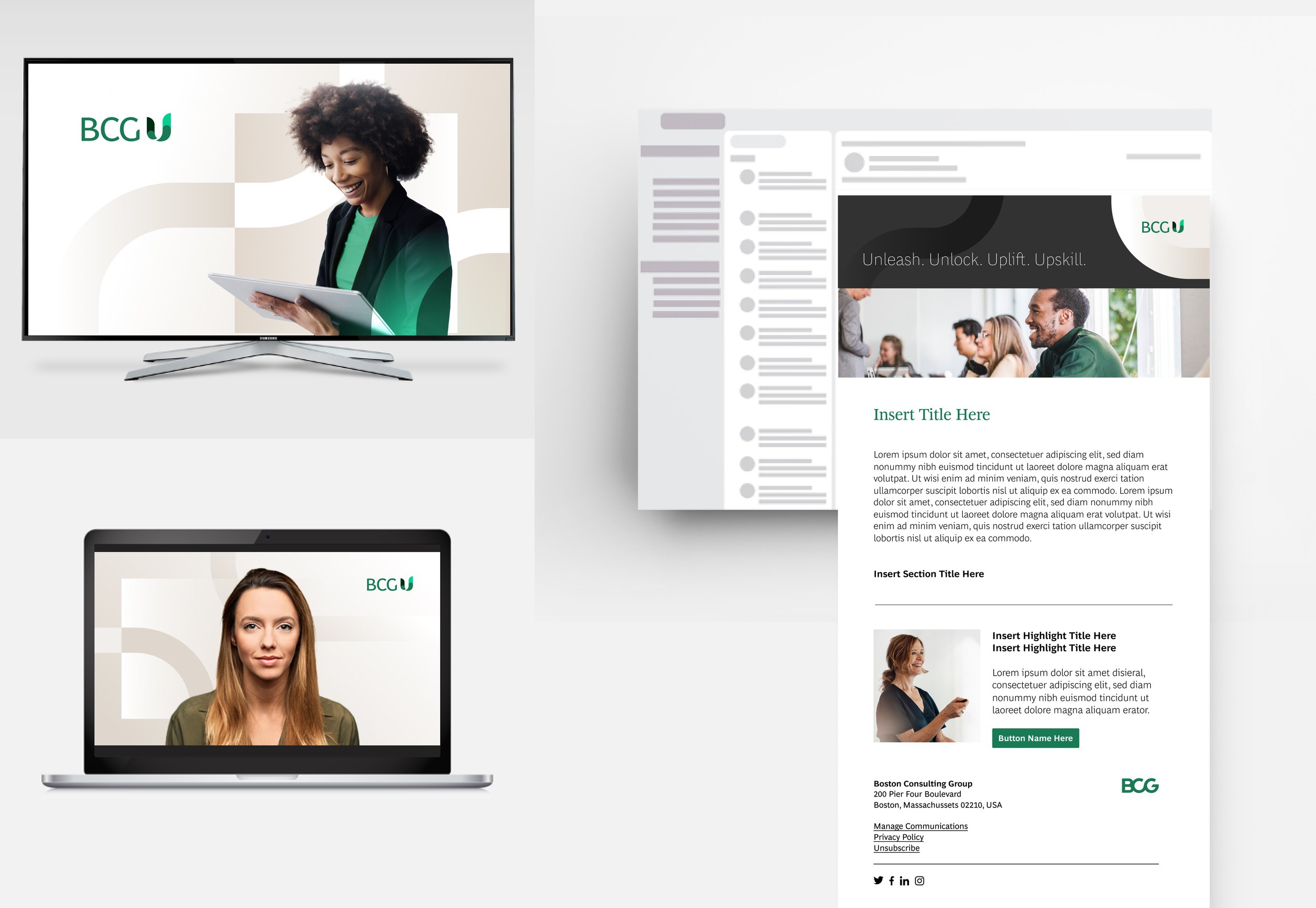
BCG U, a global advanced talent development program, needed a unified, premium brand and tone across all of its touch points. At BCG Design Studios, we reimagined BCG U’s narrative and visual identity to position it as a premium brand within the BCG ecosystem both internally and externally.


Case Study
The context
This project was a 6 month+ expert collaboration across regions, teams, and stakeholders. Deliverables included in-depth brand and competitor audit, defining the visual identity, logo and sub branding systems, brand guidelines and Source portal, marketing materials, course graphics templates, video graphics, and the possibility to extend it to future materials.
A premium brand must have consistent messaging and visuals across all touch points. This means that everything from the logo and color palette to the tone of voice and product design had to feel cohesive and concise. Attention to detail was key to communicate the sense of care and quality that sets the BCG U brand apart. We worked very closely with Global Marketing and the BCG U head of marketing to ensure brand compliance and the highest level of quality at every stage of the process.
The logo
The re-branding concept pushes into the true meaning of "U”–focusing on “you”the individual, with the goal to “Unleash, Upscale, Unlock, Upgrade, Uplift and Upskill”.
The new BCG U logo combines a reimagined U shape and modified BCG’s Henderson Sans font to illustrate forward momentum and each individual’s path forward.
The U shape originates from an infinity loop at its core, speaking to continuous growth and infinite potential. The color transition from a dark to a lighter green shows the transformation people and teams experience through the program. The beginning and end of the U, at different heights, suggest expansion and impact, from both an individual and team learning perspective.
The logo uses BCG’s primary font, Henderson Sans, with subtle modifications to visually tie it to the U mark. For content, we paired the use of Henderson Sans with its Serif version, conveying a partnership that feels academic and trusting yet modern and refined.
The visual identity
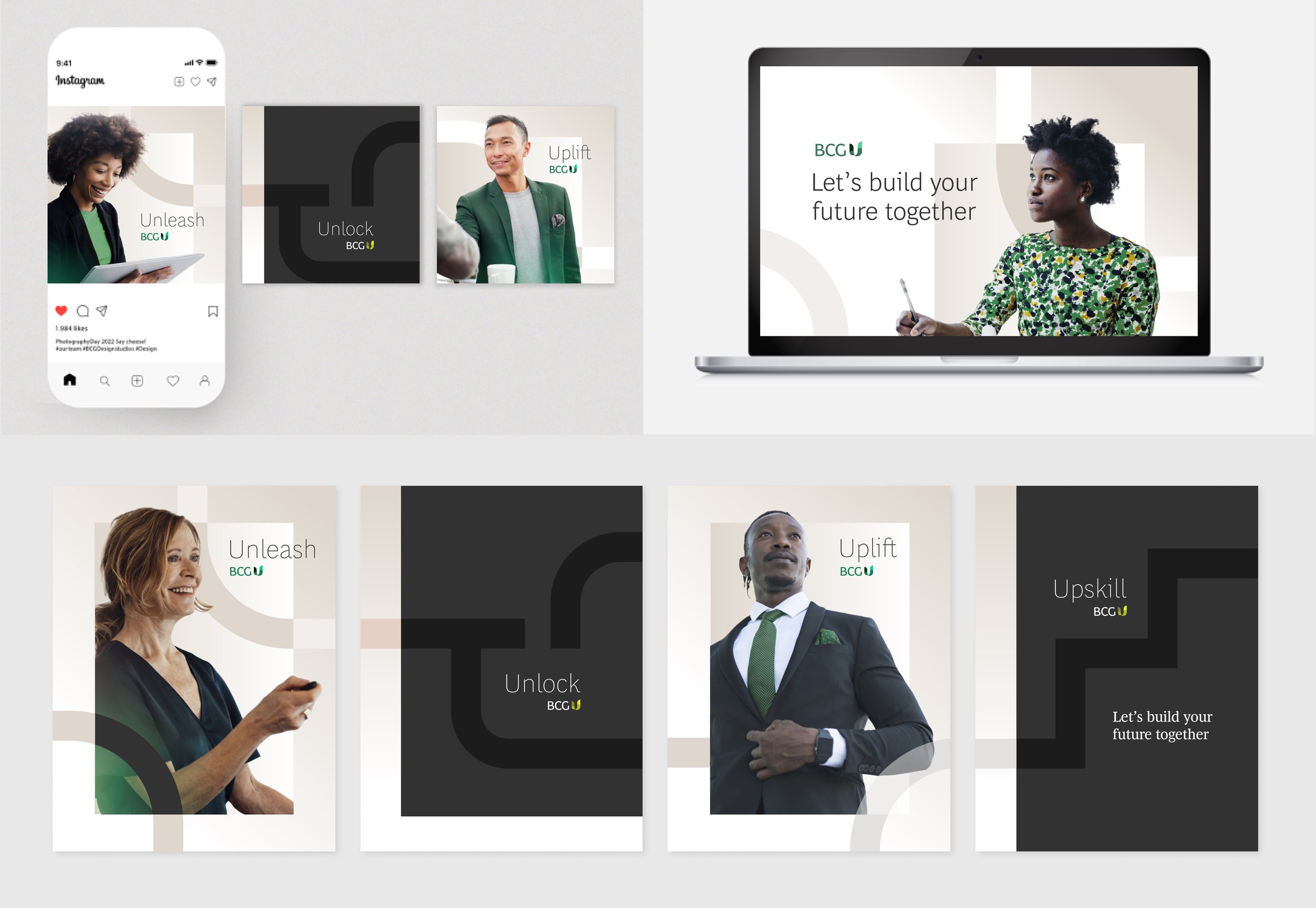
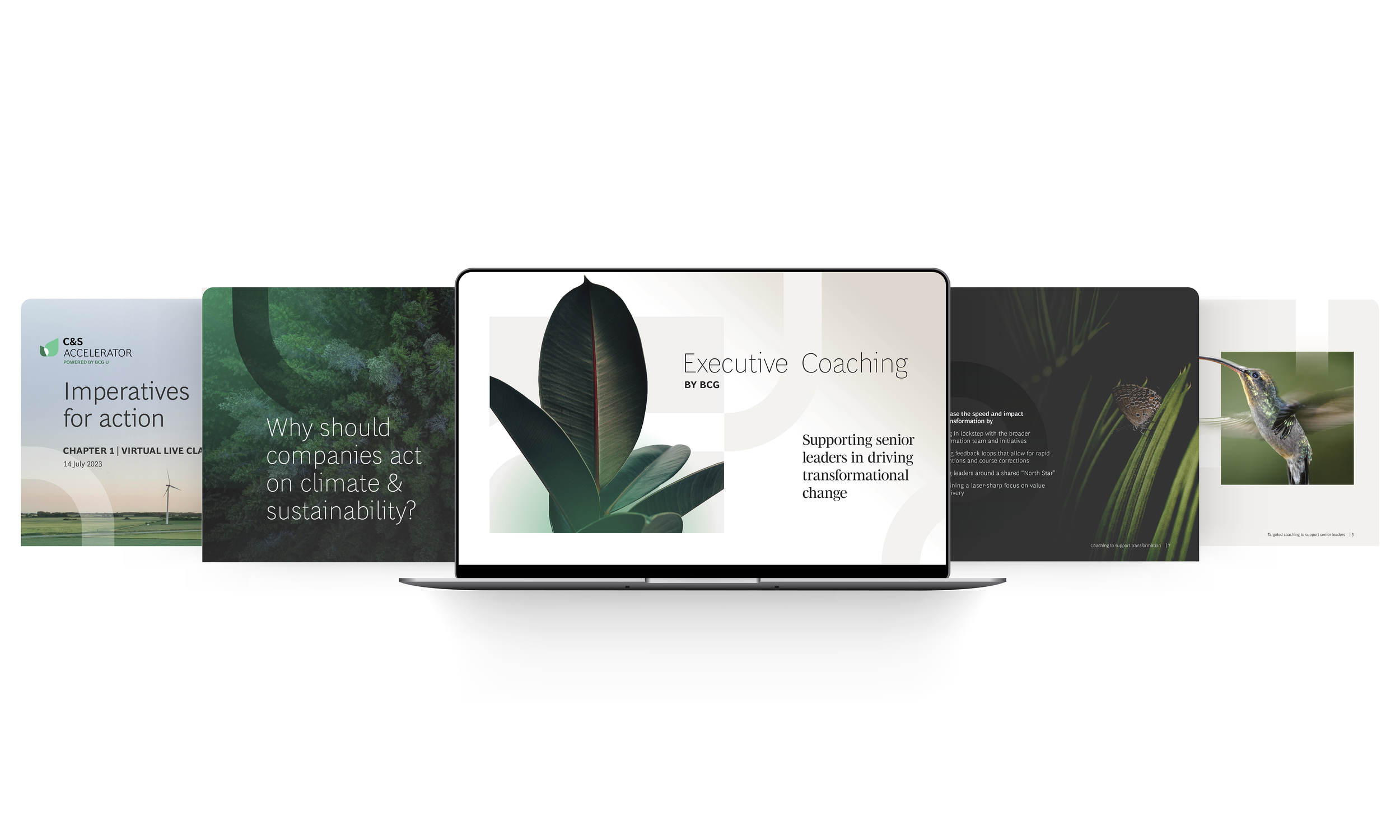
The new visual identity is built around representative pathways that convey the transformational journey BCG U provides. Minimal colors, clean lines and elevated visual elements establish a fresh canvas to place importance on photography and content.
The curved graphic elements place a focus on the different meanings of the “U” by creating purposeful abstract paths that guide the eye through each composition, showing the path forward.
A sophisticated palette of muted tones and high contrast accentuates the notion of a premium brand. The jewel tones of emerald green ground us intellectually, while the pops of mint and chartreuse bring focus and energy against the light and dark landscape to create a modern feel that sets us apart.
Because BCG U is all about building up the individual, photography becomes a core element of the brand, using human-focused imagery to convey personal connection. The compositions feature individuals breaking through the barriers of squared frames to symbolize growth and limitless potential.

